Canonical Figures
Thinking about figures that I show, or that I'd put in my thesis I realized some figures get shown so often, and reused by so many speakers they become canonical. But often these figures are a bit unique and simply the way the data is shown makes it obvious why it should be of interest.
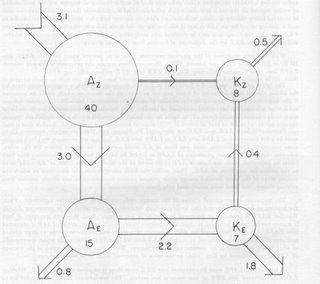
 This figure is from Edward Lorenz's 1967 book. It illustrates the flow of energy in the atmosphere.
 The circles represent energy "reservoirs", where A is potential energy (warm air) and K is kinetic energy (wind) and the subscripts identify if the energy is stored in the mean component (Z) or in the wavy component (E). The numbers in the circle is the amount of energy in the reservoir in tens of thousands of Joules per sq. metre.
The vectors indicate the flow to/from the reservoirs in Watts per sq. meter. So energy is input at the top left and it is converted into the other forms before it is dissipated.
If you were shown this figure without explantation you would not understand it, at least not within the time it would be typically shown in a talk. This diagram is not intuitive. But becase it is a canonical figure, it is shown all the time, without putting any thought into how novel it actually is.
If you gave someone the data contained in this figure and asked them to come up with a way to present it, unless that person was pretty creative it's unlikely that they would choose to present it like Lorenz does here.
But explained and knowing something about the underlying physics this diagram is a much nicer way to show the data than a table.

0 Comments:
Post a Comment
<< Home