Saturday, November 03, 2007

Another example of a matrix: Animation


Somewhere in my reading I came across this example of a matrix; with non-gratuitous use of animation.

Labels: ,

Friday, November 02, 2007

More Data Display

A blog called "Urban Spoon" came up with what it calls the Steak/Sushi Index.

The finding is not that surprising: In U.S. Cities where the ratio of steakhouses to sushi joints is higher tend to vote Republican.

This is the accompanying plot :

People often make this kind of plot to show a correlation. It is natural, because this is the kind of plots that programs like Excel encourage you to make.

This makes the point, but there is the inherent problem of how the data is ordered. A scatter plot might be more "impartial", but some information would be lost (the names of the cities).

My approach is to plot the data in a matrix

It is simple to do this in MATLAB:

Enter data into an Excel spreadsheet and save it as a .csv (comma delimited) datafile, which imports easily into MATLAB.

By default the data is imported into a matrix named data and the text is imported into a matrix called textdata.

This bit of code does the plotting

for i=1:N
text(data(i,1),data(i,2),char(textdata(i)));
hold on;
end;

Then it's simply a matter of setting the axes and making it look nice.

Update:
Looking at my plot I realized that the x quantity is not linear.

A city that has 2:1 steak:sushi will have a score of 2.00, but a place with the opposite ratio will have a score of 0.5. This is not right !

The proper scaling should be steak-sushi percentage. So I re-plot here it with that scaling.

Labels: ,

Thursday, November 01, 2007

Cool NY Times Graphic: HR Hitters

I found this cool interactive graphic on the NY Times site when it was mentioned on Edward Tufte's discussion forums.


It shows the number of homeruns the most prolific HR hitters hit at a given age. Clicking on the names on the sidebar highlights that player's graph.

Link to NYTimes Bonds Graphic

Talking about data presentation, I was also impressed to discover that on Google Finance if you enter a number of ticker symbols separated by commas it will produce a comparison plot for you :

Labels: ,

Thursday, August 16, 2007

Another Google Innovation

This Google Finance utility is awesome. I was about the rave about the Yahoo Finance charts (which are really cool) when I found this.


Not only can you easily adjust the window of the time-series, the chart also automatically populates with links to news stories you can click on, and easily see what event(s) precipitated the movement of a stock.

It's really cool to be able to combine two disparate types of "data" this way; a time series and a newsfeed.

Labels: ,

Wednesday, January 10, 2007

More Visualization Fun


Indexed has Venn diagram and other graphical jokes drawn on index cards.

Labels: , ,

Tuesday, January 09, 2007

YouTube for Data


Swivel is the so-called YouTube of data. Users can upload and share datasets and plot them against each other.

It has some weaknesses, including poor choice of the visualization of a lot of the data and also right now there isn't a lot of data there yet.

Labels: ,

Periodic Table of Visualization Methods


I discovered this Periodic Table of Visualization Methods from BoingBoing.

If you hover your cursor over the entry you see an example graphic.

Labels: ,

Wednesday, November 29, 2006

Popularity Trends

Technorati the blog aggregator has a feature that lets you see how many times a specific word gets used everyday in the blogs it follows.
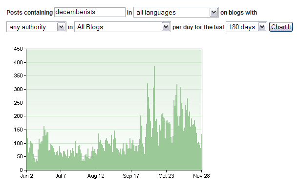
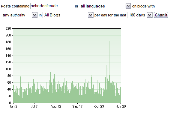
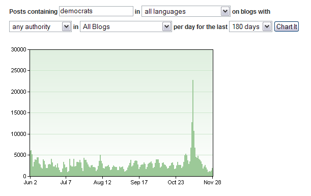
Unlike Google's Zeitgeist which compiles what people are searching for, Technorati's search tells you what people (or at least blogs) are talking about.

It also doesn't suffer from Google's signal to noise problem: for instance Jay-Z or Eminem will always get more searches on Google than some hot indie band. So you can see the Pitchfork Effect at work.

A coupla weeks ago when I thought the Decemberists were getting overexposed in the blogs, I wasn't imagining.


There was a definite upswing in early November.

Here's the mentions for "Lukas Rossi" over the last 6 months:


You can see a definite weekly cycle leading up to the Supernova finale, but he's basically fallen off the radar since.

Reading some blogs recently, I came across a word which was popular for a while, but I hadn't seen in a while - Schadenfreude :


... and boom!, there was in fact a sudden spike. What could that be ? I looked for some correlations :


... ahhh, or how about ...


Hah ha!

Labels: ,

Tuesday, November 28, 2006

Fleeced! / BCG Matrix

Last week Cramer used the imagery of a naked sheep, one that had been sheared of all it's wool so that it looked naked and skinny and wrinkled; to describe what happens to people who speculate on currencies. That's when I came across the picture below of a half-sheared sheep.

I always like a good graphical way to display data or explain a concept.


Somewhat related, I first came across this graphic :

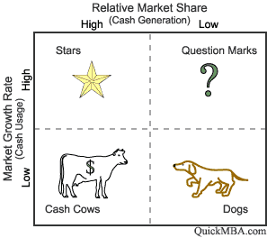
back here. I assumed it was the author's invention. It turns out that it's a real thing, known as the BCG Matrix.

Labels: , ,

Thursday, April 06, 2006

Canonical Figures

Thinking about figures that I show, or that I'd put in my thesis I realized some figures get shown so often, and reused by so many speakers they become canonical. But often these figures are a bit unique and simply the way the data is shown makes it obvious why it should be of interest.

This figure is from Edward Lorenz's 1967 book. It illustrates the flow of energy in the atmosphere.

The circles represent energy "reservoirs", where A is potential energy (warm air) and K is kinetic energy (wind) and the subscripts identify if the energy is stored in the mean component (Z) or in the wavy component (E). The numbers in the circle is the amount of energy in the reservoir in tens of thousands of Joules per sq. metre.

The vectors indicate the flow to/from the reservoirs in Watts per sq. meter. So energy is input at the top left and it is converted into the other forms before it is dissipated.

If you were shown this figure without explantation you would not understand it, at least not within the time it would be typically shown in a talk. This diagram is not intuitive. But becase it is a canonical figure, it is shown all the time, without putting any thought into how novel it actually is.

If you gave someone the data contained in this figure and asked them to come up with a way to present it, unless that person was pretty creative it's unlikely that they would choose to present it like Lorenz does here.

But explained and knowing something about the underlying physics this diagram is a much nicer way to show the data than a table.

Labels: ,

Monday, April 03, 2006

Presentation of Data: Examples

Following my post on Ed Tufte and the presentation of data I remembered these graphics from Toro Magazine (a wannabe Vice-type mag that comes with the Globe and Mail).

I can't remember ever seeing a pie-chart in a physics talk, but pie-charts are a staple in low-brow business pitches and pseudo-technical presentations, along with non-ironic use of Comic Sans and mortifying clip-art.

So for my talk last week, I really regret not working in a gratuitous pie-chart displaying some completely inane data; the only purpose it's really suitable for -- but given the (lame-o) state of my research I wasn't feeling too cocky either.

...and below is one of my fave types of graphics, a phase-space plot. These plots are really illustrative (seriously), and I think science people should use them more often.

Someday I will have to get off my ass and figure out how to get Matlab to plot words in a 2-D plot.

Labels: ,